
Since 2010, the number of websites in existence has increased from 200 million to nearly 1.8 billion, according to Internet Live Stats. How is a brand supposed to stand out? We’ve often discussed on our blog the importance of using strong visuals. In addition, brands need to take a careful look at the typography on their site. Typography is an analog-era term referring to the style, arrangement, or appearance of typeset matter. But typography also applies to digital content in a very important way.
When you look at content on a webpage, your eyes tend to jump around from object to object. Our job as marketers and designers is to make sure each webpage is well balanced in order to increase maximum viewability. In return, a visually appealing webpage creates more engagement with users and increases the amount of views, clicks, and conversions. Users are also more likely to remember content, images, or the brand name when the webpage is more visually appealing — thus, creating more brand engagement. Here is where typography comes into play.
What Is Typography in the Digital Age?
Typography consists of all the written elements on a page that make up its style. These can include specific colors, typefaces, the space between characters and paragraphs, the font style, size, and weight, and other embellishments.
In a sense, typography is a balancing act. The content and images on a page need to be perfectly balanced in order for the content to maximize the space on the page and to appear visually attractive to the consumer. Each element needs to be executed to perfection in order to create this essence of balance.
Typography and Brands
Typography is especially important for brands to engage a user. The typography a brand selects says a lot about the brand itself: its name, values, style, etc. A livelier typeface, such as Disclaimer or Gatsby, suggests that the brand contains an element of fun and flair. A more elegant serif or cursive font, such as Adelaide or Hamilton Grand, suggests a more sophisticated style from the company. The same goes for serif and non-serif fonts. The fonts can give off a more serious versus youthful vibe.
Brands need to be consistent with typography, including considerations such as the color, word choice, typeface, size, and spacing. Without these there would be no clear focus, and the webpage content would appear cluttered. Here are a few examples of considerations brands need to keep in mind when choosing typography:
- Readability. Tracking, kerning, and leading are equally if not more important than selecting the most suitable typeface for the brand’s style. These three elements of typography help with the readability and legibility of the content. They maximize the spacing of the letters, words, and paragraphs so that the reader is able to read with ease. Additionally, a piece of content that is easier to read will draw in more readers.
- Hierarchy. With typography, it is important to maintain a balanced type hierarchy. The goal is to direct the user to the most important points on the page. The most important element on the page should be the most dominant item on the page, or the easiest for the eyes to locate. Following a hierarchy allows for the readers to read with ease and locate the most important elements on the page first, with all other elements following depending on level of importance. If the title or main headline is the most important message, then it should be the easiest for the eyes to locate on the page, with sub-headlines, descriptive text, images, captions, etc., following. The hierarchy does not need to follow this order specifically. It can vary depending on the level of importance to each business.
Other factors that influence typography include the use of responsive design. A site that uses responsive design adapts to the size of the screen regardless of the device a person uses to view a site. A webpage that uses responsive design also demonstrates good hierarchy and maintains a sense of flow and balance, drawing the reader’s eyes to the most important aspects of the page first. Some of my favorite examples include the Milwaukee Ballet, Food Sense, and Forefathers Group.
The Importance of Consistency
Although this post has focused on the use of typography on websites, businesses should choose typography that creates brand consistency everywhere people encounter the brand, such as webpage, business cards, flyers, posters, etc. Everything should create a sense of overall flow and should be recognizable to the brand itself. In order to maintain this “flow,” marketers should familiarize themselves with the brand’s standards guide, and if the brand does not currently use a guide, the company should create one.
A brand standards guide contains all of the typography elements that pertain to a brand: size, color, tracking, kerning and leading, typeface or a specific font style, as well as guidelines around the company logo such as where to use a logo. By being familiar with the guide, marketers can create consistency. If a company is looking to rebrand, it is also important for marketers to consult the branding guide in order to revamp the new brand but keep intact the integrity of the old brand. Doing so ensures that the new brand does not stray too far from the current view and perception of the company and maintains brand permanence.
Company Examples
Amazon
Amazon is an example of a company that uses elements of its logo across multiple media. For example, the packaging calls out Amazon as well as directs the user to the Amazon website. The packaging also uses the same arrow on the box that it does within the brand logo, going one step further to create a more memorable brand experience and demonstrating consistency across all markets.

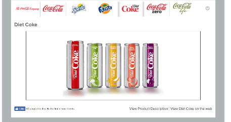
Coca-Cola
Coca-Cola has always used typography and color to distinguish between various products. The original Coca-Cola logo uses a lively script font unique to the Coca-Cola brand. Diet Coke uses a similar script to distinguish the “diet” aspect of the product and then uses a modernized serif font that intertwines creating that same script feel. The colors used in the cans are unique to the flavor of the drink. The website also uses these colors to tie the brand together. On the homepage, silver is used as the main background color, with black as a secondary color for type and other graphic elements, and red being used to indicate the most important features on the page. Each product’s subpage is unique to the specific product itself and is similar to the can in which each drink is sold. Coca-Cola uses different dominant colors for each: Coca-Cola red, Diet Coke silver, and Coke Zero black. This application demonstrates good brand consistency since consumers are familiar to the style of each can.

True Interactive
We recently rebranded from KeywordFirst to True Interactive. While rebranding the company, we maintained the integrity of the old brand by continuing certain aspects into the new brand. Our colors remained the same—orange and grey—as did the placement of the type. The main difference is that the style of the type was revamped.
Across all our social media we use similar profile pictures of our logo that contain the full logo or portions of it. Our cover photos are also consistent across all media using either a photo that depicts our brand in a clear and concise manner, or colors that are consistent with our company vibe. Our website uses the same orange and grey colors, as well as the same font style, to create a sense of unity across all of our pages.


How well does your choice of typography reflect your brand? The answer may not be obvious especially if you are undergoing a major corporate change such as a rebranding or a merger. If you’re not sure about the answer, it might be time to take a closer look at what your brand stands for and how well your style reflects your brand values.